
Personal Project
Battle of the Bands:
Every year at Ramsey Solutions, they hold a Battle of the Bands competition, where 8-10 bands duke it out for pride, glory, cash, and a customized trophy. But what’s a great show without some killer posters? The only design rules are to avoid using photographs and to capture the spirit of the band you are tasked with representing.
Services Provided:
Digital Illustration
Lettering and Typography
Layout
Video Graphic


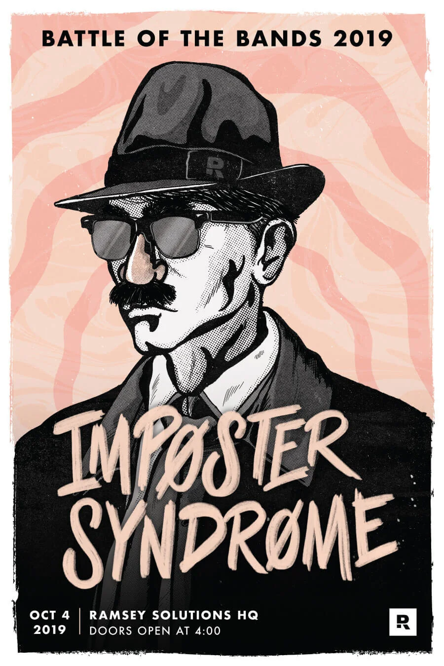
Imposter Syndrome:
For 2019’s competition, I was immediately drawn to Imposter Syndrome. The band voiced the vision of a man in a trench coat who embodied the vibe of an old spy movie. I liked the core idea and wanted to lean into stark, high-contrast, film noir-style imagery. I started with some initial designs that incorporated goofy fake glasses and a mustache, incorporating a comedic element and displaying the idea of an imposter.

Initial Concept Sketches
Poster Concept 1
Poster Concept 2
Layered Poster Design Process
Process:
After working on some simple thumbnails, I drew the core idea in Procreate, blocking out lighting and shading. I wanted the subject to feel like an old comic book character, so I brought in a bunch of fun textures and illustrative lines.
Once I was happy with the sketch, I brought it into Photoshop to clean up the coloring and digitally paint the halftone shading. One of the feature songs the band intended to play was Pinball Wizard by The Who, so I brought in some funky colors and psychedelic textures to play off of the serious nature of the illustration. I rounded out the dominant gray tones with some peach colors and a rough, brushed treatment to pull everything together.
Typography:
I wanted the type treatment to feel a little chaotic and scattered, like it was hand-written and scribbled hastily to indicate that the author wasn’t confident in what they were saying. Again, I was able to turn to Procreate to get the desired effect, which I added to the final assets.
Final Poster DesignFinal Assets:
While we were tasked with creating promotional posters, I also created slides that were displayed on company TVs throughout the office in preparation for the show. Finally, I created a simple, animated backdrop for the giant screen behind the band while they played.

Band Playing in Front of Animated Digital Poster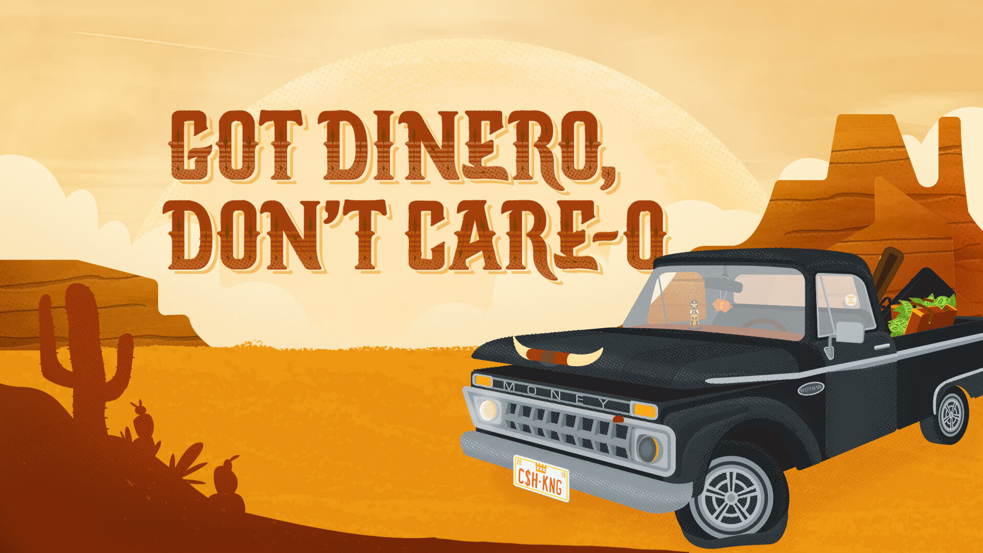
Got Dinero, Don’t Care-o:
In the 2018 clash, I was assigned a good ol’ Southern band who wanted a country vibe. Their band name was inspired by the lyrics from “Toes” by the Zac Brown Band, and they loved the spirit of picturing someone without a worry in the world and a cold beer in hand. The band connected with the story about a guy who was debt-free and who drove a beater truck for the sheer joy of it.


Poster Concept SketchesTruck:
Based on the band’s feedback, I knew it was important to feature an old pickup, and I was inspired by the 1954 Chevrolet 3100 and 1965 Ford F100. I worked in Illustrator to use those classic looks to inspire nostalgia and charm in my truck design.

Illustrator Design File
1954 Chevrolet 3100 Illustration
1965 Ford F100 Illustration
Layered Poster Design ProcessProcess:
Visually, I wanted to lean on warm tones and desert vibes, setting the scene in a classic southwestern desert that matched the tone of the bands’ setlist. After getting the initial elements drawn in Illustrator, I moved everything into Photoshop to add textures and color, incorporating subtle halftones and grit to give the poster the right amount of punch.
I also worked on some custom typography for the band name that was inspired by classic tequila labels’ letterforms, adding spurs and shading to bring the whole design together.

Poster Typography Process Work
Final Poster:
I wanted the final poster to be something that kept revealing little details the more you looked at it, so I dropped a few company-specific Easter eggs into the design to expand the story. After illustrating a suitcase full of cash and a vanity plate of one of Dave Ramsey’s favorite sayings, “Cash is King!”, I also added a playful luchador bobblehead and some other accents to capture that southwest vibe. I rounded out the poster with a piggy bank air freshener, “money” grill, and “peso es jefe” window sticker.

Peso Es Jefe Easter Egg
Luchador and Piggy Bank Easter Eggs