
Campaign Theme

Campaign Shirt

Campaign Print Material
Ping Pong-A-Thon: Melbourne, Australia
The Challenge:
Ping Pong-A-Thon is a Melbourne-based organization focused on bringing freedom to the world’s most vulnerable in Southeast Asia because everyone deserves to live a life that is free. They help Australians and Americans alike engage their networks with fun, table tennis fundraising events that make a positive impact both in their communities and around the world.
Every year, Ping Pong-A-Thon rallies their tribe around a central theme that drives the creative direction of their annual campaigns and unites people in the fight against human trafficking. With a new year in the books, the Pong team needed their entire campaign suite updated. I worked with them to create a foundational marketing packet of print, digital, and social media assets they could provide to event organizers in order to build momentum.
Services Provided:
Visual Identity and
Discovery
Campaign Design
Messaging and Copywriting
Lettering and Iconography
Print Assets and Slide Deck
Logo Design
T-Shirt Design
Social Media Assets

Campaign Theme:
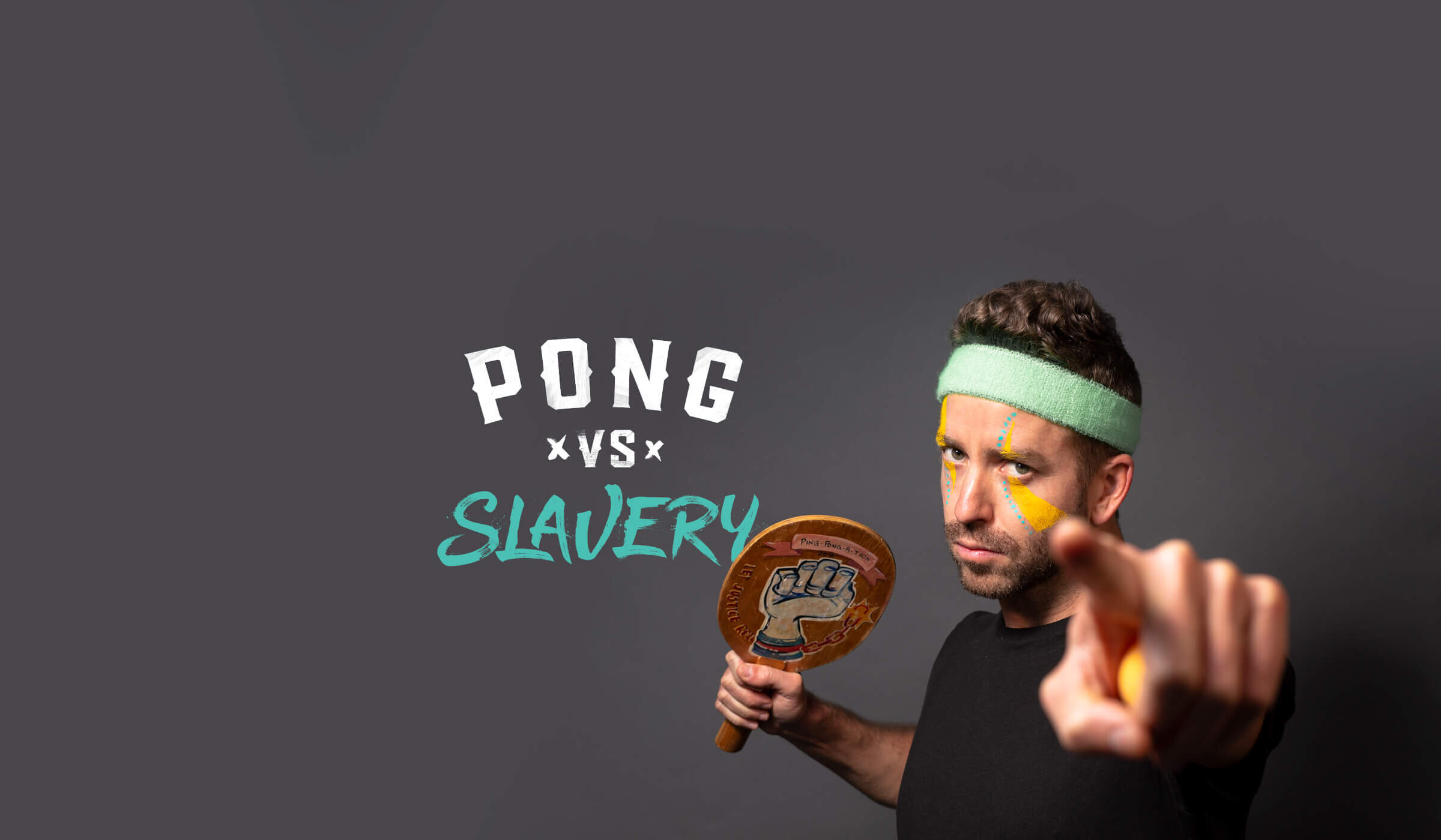
After talking through the overall messaging, we zeroed in on a few specific tag lines. Ultimately, we wanted something straightforward that made the campaign goals clear to anyone, regardless of their familiarity with the organization. We landed on “Pong VS. Slavery” as a clear, action-oriented call to get players into the fight and remind them we’re all on the same team, playing against the evils of slavery and trafficking. This simple strategy unified players and kept everyone focused on the ultimate goal of the campaign—liberating the world’s most vulnerable.


Campaign Theme SketchesProcess:
I started by sketching different logo ideas that felt tough and gritty, supporting the campaign’s call to arms against trafficking. In the final markup, I worked on some custom brushed typography that was purposefully messy and aggressive to capture the ugliness of “slavery” and finished it up with a gritty texture to lean into the idea of “fighting.”

Digital Exploration for Campaign Theme

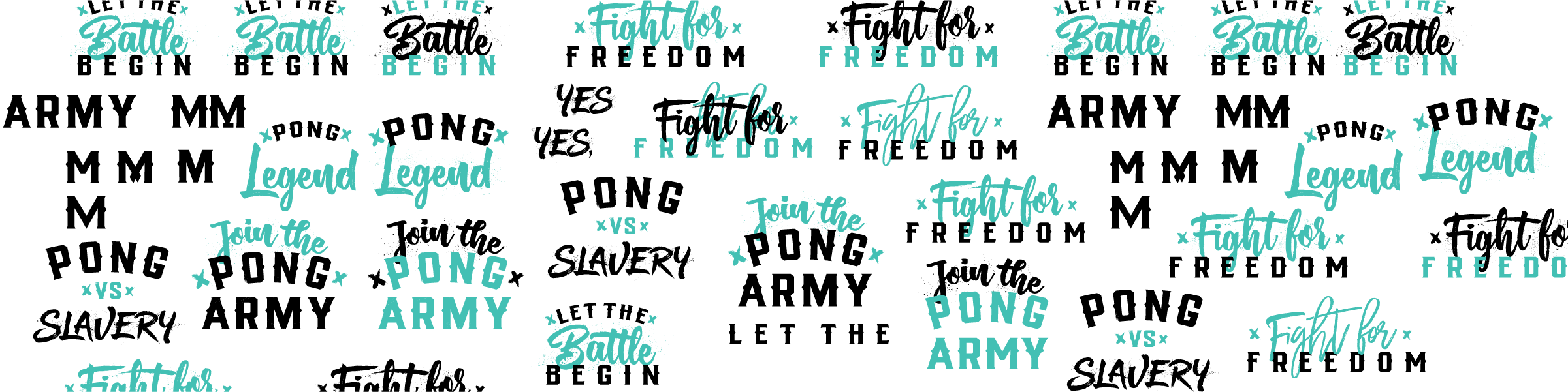
Final Campaign LogosStylized Keywords:
After finalizing the main logo, I established a few extra tag lines that the Pong team could rally around, furthering the message of entering the fight and rallying the troops. I paired images with these keywords for social media posts, and they served as downloadable assets that fundraisers could use to promote their own events. I also worked on some customized posts for the Pong team to use when celebrating key milestones in the campaign.

Custom Facebook Banners
Key Moment Social Media Images
T-Shirt:
I also designed custom T-shirts for volunteers and event organizers highlighting their brand slogan “Serve Up Some Justice” with a fun, dual-color design based on of one the rejected campaign logos. Once I had it roughly sketched, I brought it into Procreate to fine-tune the main idea. After lettering forms and mapping out the right flow, I brought everything into Illustrator to perfect the fine details and get it properly exported for screen printing.

T-Shirt SketchesOld Assets and Messaging:
Prior to the update, I created an outline for the Pong’s content strategy. We needed to focus on simplifying the messaging across every touchpoint and clarifying each players’ roles. We decided to focus on their event organizers, people who signed up to actually host individual events, to help them feel supported and informed as they called their own communities to action. We created each piece with a clear action plan while sharing life-changing stories from the field to keep their teams motivated and inspired.

Old Campaign Assets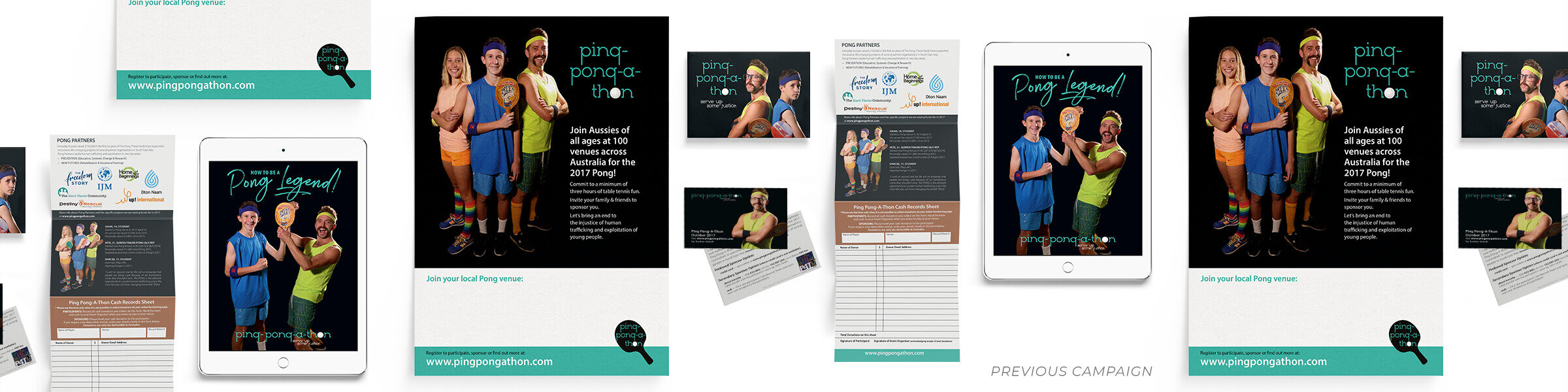
Updated Assets:
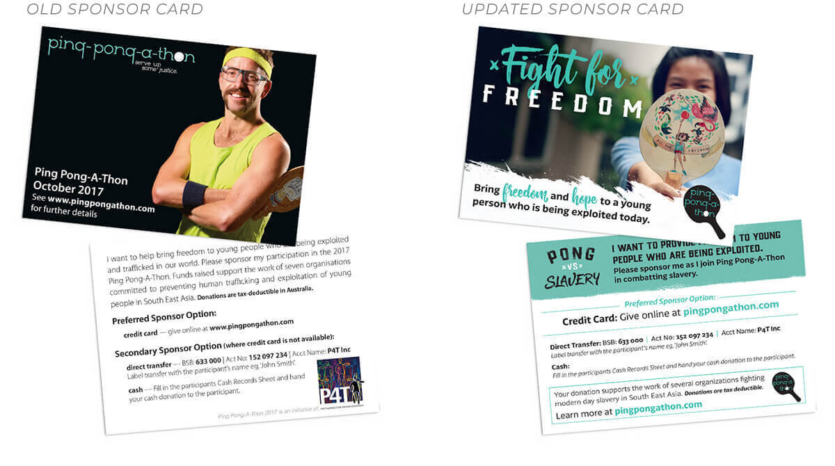
Historically, Ping Pong-A-Thon relied on three main print pieces as their primary promotional materials: an informational brochure to encourage people to host events, a small sponsorship card that players could give to donors who wanted to financially support them, and event posters organizers could hang up in their neighborhood. I applied the new campaign branding to their old assets, clarifying them into one cohesive message.

Brochure:
The brochure is one of their most important assets, as it provides the most in-depth information for who Ping Pong-A-Thon is and what they do. It was important that this piece communicated the Pong’s mission clearly and effectively. The previous brochure served to introduce the theme, give an overview of the movement, highlight their international partner organizations, and provide a means of tracking cash donations. Since most donations were online and organizers had been provided with a separate cash tracker anyways, this section felt unnecessary. While the three action steps to join team Pong were helpful on a basic level, they weren’t accurate representations of what to expect.
With the updated brochure, I clarified the exploitation issues that Ping Pong-A-Thon combats and the reasons for holding events in the first place, explaining how the reader could change a life forever, incorporating a survivor’s story, and highlighting players to give examples of excellent event participation. This outline led to the same three-step process, calling the reader to action by signing up for an event.

Old Fundraising Guide:
Once people actually signed up to host an event, they were given access to Ping Pong-A-Thon’s online fundraising portal and provided with a fundraising guide to walk them through the next steps. This guidance answered FAQs and gave specific instructions for tackling the larger steps. While the old guide had great content, it needed a clearer hierarchy of tasks to make it easier to navigate along with an overall facelift to match the new campaign design.

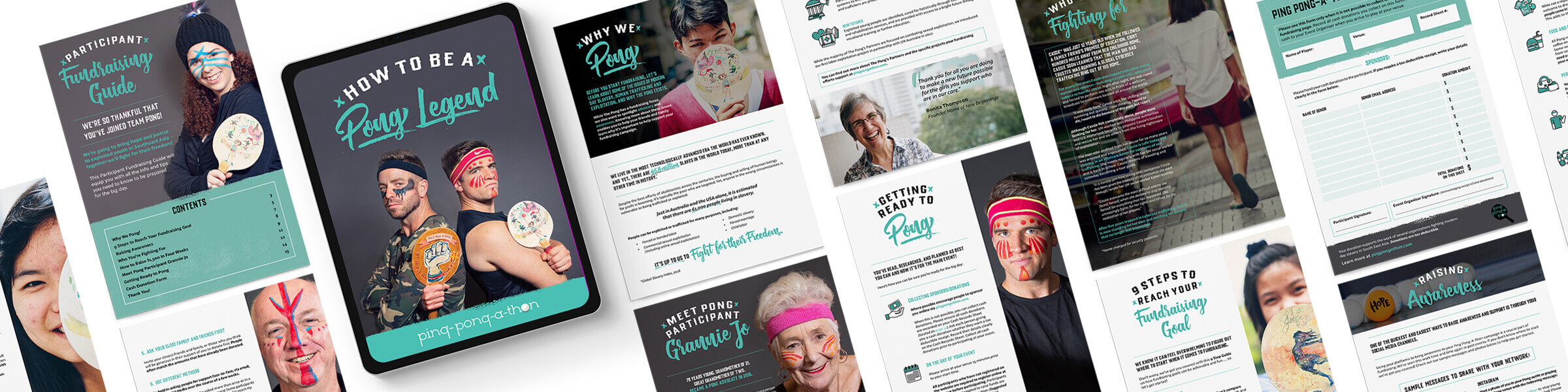
Icon Style:
I created a custom set of icons to highlight a number of key points. Each one was designed to incorporate the texture from a ping pong paddle, as well as the Pong’s signature green color to connect back to the main brand.


Updated Guide:
With the new guide, we wanted to place an emphasis on stories to help connect event organizers with the cause. Since they needed to promote the purpose of their events, we provided them with a high-level overview on the issue of trafficking in South East Asia and explain the Pong’s model. We also included stories from survivors, partners, and other players to help connect emotionally and inspire the organizers. Everything was buttoned up in a digital PDF that was linked to a wealth of additional assets so that it could serve as the main source of truth going forward.
Informational Cards:
I created a series of information cards that participants could use to encourage their friends to host their own events, along with a descriptive card to explain what Ping Pong-A-Thon is and what they do in a simple, digestible format. Additional cards were designed to target specific audiences within Ping Pong-A-Thon’s three main audience groups: schools, churches, and businesses.


Business Cards:
With the clarified branding incorporated into their other assets, the Pong team requested new business cards that could match the look, tone, and feel of their other branded print pieces.