


SmartDollar: Forest, VA
SmartDollar Brochure:
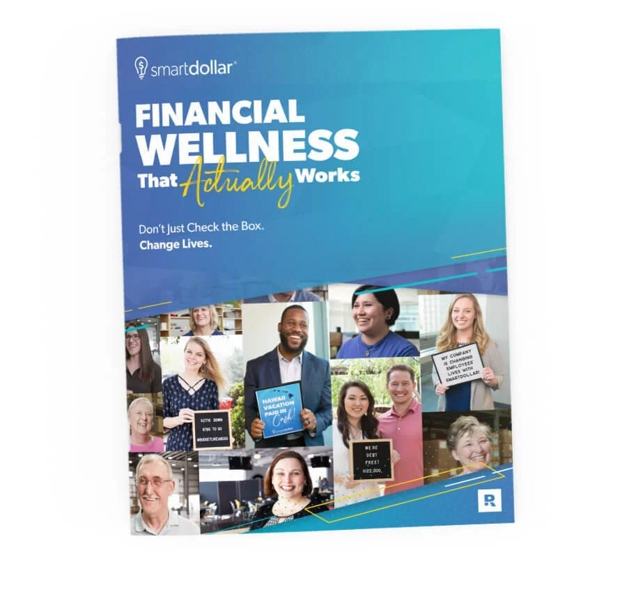
SmartDollar relied on a key brochure as a high-level overview of our product. This was one of the most frequently used print pieces we handed out to interested clients and it desperately needed an update to match our new messaging and visual tone.
Services Provided:
Visual Identity and Discovery
Typography and Iconography
Messaging
Layout
Photo Direction
Old Brochure:
Our old brochure relied heavily on illustrations, stats, and product features. We wanted to expand it to include user and client photos, as well as focus on benefits over features.
Old SmartDollar BrochureUpdated Brand:
This brochure provided the opportunity to serve as the cornerstone for our new brand direction. We wanted to focus on bright, hopeful colors and bold, dynamic gradients. The mantra that shaped the visual direction was “warm, real, and bold.” We wanted readers to feel the hopeful message at the core of our brand that expressed itself with real-life changes for everyday people. We also wanted to convey our passion with bold colors and typography.
Visually, it was important to highlight the humanity of the brand. We included brush fonts and marker treatments to add a more organic feel to our content and added different layers and levels of depth to our imagery to keep it dynamic. We also included angled shapes and slanted lines to denote speed, action, and the forward movement that employees experienced with our program.


Layout Sketches and Conceptualization

Messaging Exploration and Client Quote TestMessaging:
We wanted the tone of our content to be conversational and human while conveying our passion and hopefulness, so we focused on introducing quotes and success stories from clients and users, letting the results speak for themselves. We kept the content simple and clear so that everything was easy to understand. Visually, we accented key statements with a brush script to denote that human touch.

Product Mockup Sketch
Final Photo With Mocked Up SmartDollar AssetsShowing the Product:
As a digital product, we wanted to be intentional about how we showcased some of our key features and tools. We wanted to dedicate a key spread to our secret sauce: the three main things that make SmartDollar the best financial wellness product out there. In order to highlight the fact that our program is accessible anywhere, anytime, on any device, I brainstormed a desktop scene to feature on that spread. I worked with a teammate to recreate the rough sketch and shoot the scene to fit the layout of the page, enabling us to stylize the scene and help potential clients envision how their employees would use SmartDollar.


Updated SmartDollar BrochureADP: Roseland, NJ
ADP Sales Packet:
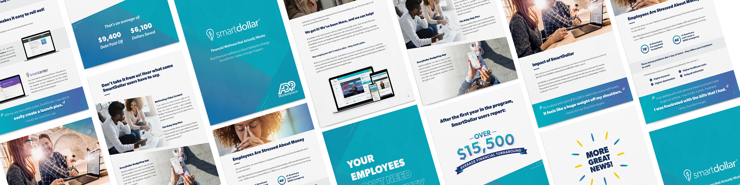
In 2019, SmartDollar launched ADP as a strategic partner. We were able to work with their sales representatives to help pitch SmartDollar as a benefit that clients could purchase through ADP’s Marketplace. In order to help their sales team better understand SmartDollar, they requested a sales packet that could provide an overview of our product.
Services Provided:
Visual Identity and Discovery
Typography and Iconography
Messaging
Layout

Old SmartDollar BrochureOld Brochure:
At this point, we hadn’t had the opportunity to update our old brochure yet, and we knew we needed something specific to serve their needs. Our old brochure didn’t quite work, and we knew the new solution needed to feature more photography and new branding.

Layout Exploration and Key ElementsVisual Update:
Another designer started with the initial concept, but after reviewing it as a team, we wanted to go a slightly different direction. After taking a step back, I was able to use some of the key elements I loved to overhaul the rest of the look. I wanted to lean in on the angles and colors while trying some layouts that incorporated more depth into the design. I also wanted to include our brush script to add more of an organic feel.
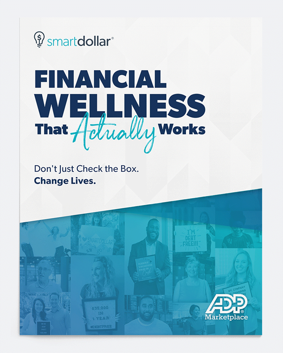
Final ADP Sales PacketFinal:
Once I was able to get into the project, I worked with our marketing team to refine the messaging throughout. We loved the idea of including quotes and featuring two pages with huge callout statements. Overall, we wanted the messaging to feel positive and motivational. The final sales packet succeeded in giving ADP’s team an in-depth understanding of what SmartDollar is and exactly how to guide clients through purchasing our product on ADP’s Marketplace.

Simplified Sales Flyer ConceptSimplified Sales Flyer:
The ADP team was thrilled with the brochure, but their team also wanted a short one-pager they could take with them to meetings and add to benefits packets. As such, we worked on distilling the main points of the packet into a two-sided flyer which gave a high-level overview of the need for financial wellness, while sharing our results and successes through client quotes.

Final Sales Flyer