
SMARTDOLLAR PROMOTIONAL MATERIAL


SmartDollar: Franklin, TN
PROMOTIONAL CAMPAIGNS:
Our team provided seasonal promotional assets to clients to help them promote SmartDollar as their financial wellness benefit. The goal was to make promoting our benefit as easy as possible, so we did the heavy lifting of ideation and creation so that our clients could add custom details as desired and then easily share them. We created a series of evergreen themes for clients to use, no matter the time of year.
Services Provided:
Visual Identity and Discovery
Typography
Digital Illustration
Layout
Messaging

Explore a Brighter Future

Millionaire Movement

Rock Your Resolutions

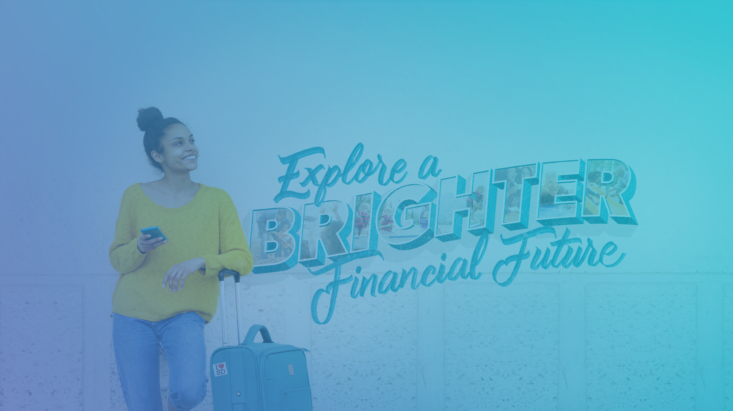
Final Poster DesignExplore a Brighter Financial Future:
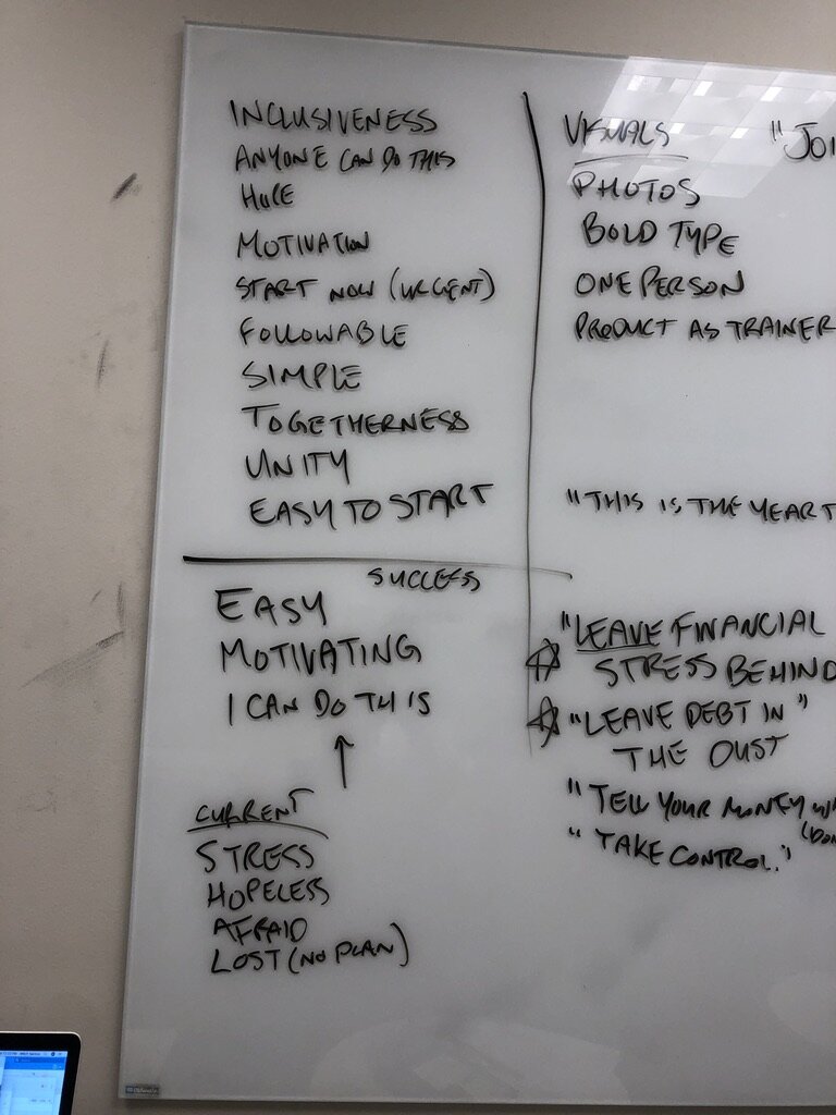
For our 2019 Fall campaign, we wanted to focus on a travel-themed campaign that connected with a core message on the power of budgeting. I brainstormed a series of tag lines with the lead marketer on the project to help hone both the visual direction and tone. We liked the idea of taking off on an adventure to achieve your financial goals, tying the idea of an exciting trip in with financial goals. We also liked the idea of making a budget the key to getting there, almost like a passport.

Concept Brainstorming Word Map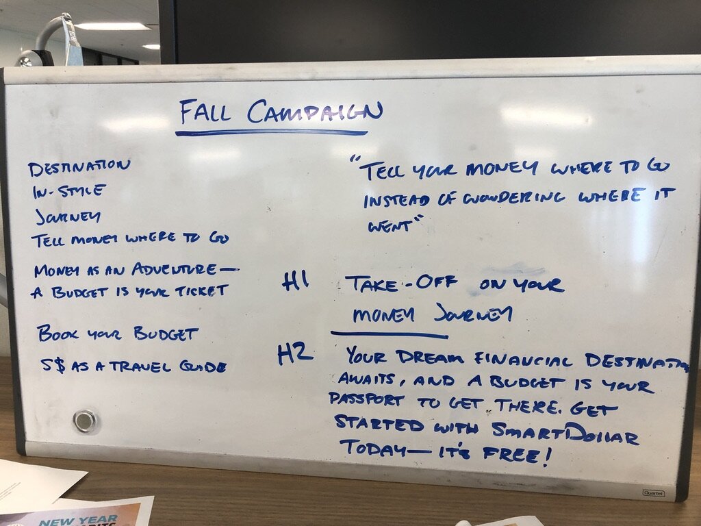
Tagline TestsProcess:
While another designer took the lead on creating the final assets, I supported him with the creation of hero imagery, as I had a high level of familiarity with the overarching tone of the campaign. I was inspired by old travel postcards and murals for the visual direction and loved the classic “Greeting From . . .” designs that featured states’ names in bold letters. My teammate found a great picture of a woman leaning against a wall and, with that, we had the perfect canvas to design on.
I started by creating a basic type treatment with some 3D type and classic wave look. I inlaid it with a series of images representing different financial and retirement goals clients could budget towards, like buying a house, traveling, and spending time with grandchildren. I then brought it into Procreate and lettered the remaining words with a similar style and tone to the old postcards. Once all of the typography was done, we brought it all into Photoshop to be combined with the hero imagery across all assets.

Hero Image DesignThe Millionaire Movement:
In 2018, Ramsey Solutions conducted the largest survey of millionaires ever with 10,000 participants. As a company, we wanted to share the results across our different channels and promote the launch of Chris Hogan’s new book “Everyday Millionaires.”
Theme:
With that in mind, our team worked together to figure out a way to connect the theme of “millionaires” with our audience for our 2019 New Year’s assets. After brainstorming a series of motivating themes, our marketing team loved the idea of calling users to join a millionaire movement and getting them to enact habits that would get them on the right path. I sketched a few different ideas that could visually convey the spirit of the campaign.
Campaign Goals
Visualization Exploration
Typography:
The original request was to take a typographic approach and to focus on the seven baby steps that really highlight the users’ journeys. I worked on a glossy typographic treatment and paired it with a seamless SmartDollar pattern inspired by our 7 Baby Steps.

Seamless SmartDollar Pattern
Initial Concepts:
Based on the brief, I presented these two initial rough drafts. They both were featured large typography, one with the pattern and another stylized similarly to other Ramsey designs. Ultimately, our team decided it wasn’t quite right. Up until this point, the SmartDollar brand had relied heavily on illustration, so we decided to pivot with an entirely different approach.


New Sketches and Conceptualization
Brainstorming Session for New Campaign Direction
New Typographic Treatment Exploration
Digital Illustration:
With that feedback in tow, I got down to sketching new concepts. Based on our earlier brainstorms, I really liked the idea of focusing on a path that was easy for a user to follow. Focusing in on the easy step-by-step instructions, I wanted to connect the idea of a GPS getting someone from point A to point B easily and clearly. I wanted users to think about SmartDollar as a GPS for their money, telling them exactly what steps to take to reach their financial goals.
I then worked on two main hero illustrations. Considering this was a New Years’ campaign, I knew a lot of people often set health goals, and incorporating a runner felt like another way to connect with users. I focused on bright, hopeful colors and a minimal color palette that featured a new user taking their first step into the journey towards becoming an everyday millionaire.

Updated Concept Based on Brainstorm
Additional Concept/Final Design
Final Campaign AssetsFinal Assets:
After agreeing on the final direction, I added it to the final set of assets. All promo campaigns consist of a suite of materials including posters, detailed flyers, digital media banners, postcards, and email templates. The purpose of each campaign is to support our clients and make it as easy as possible to share SmartDollar with their teams. The wide range of assets works for traditional office environments, and each piece includes customizable space for clients to add any additional information and their unique enrollment link to get employees into the product quicker.
Rock Your Resolutions Campaign:
For our 2020 New Year’s campaign, we wanted to do something different. We had introduced more photography into our brand and were no longer using stock photography. We wanted to use this campaign to feature real SmartDollar users. Luckily we had the Gould family scheduled to come into the office to do their debt-free scream on The Dave Ramsey Show. They had an awesome story about buckling down and paying off over $54,000 of debt in a single year!
While they were on-site, we set up our photo studios and did a really fun shoot with the whole family. Knowing it was a big moment for them, we brought in all sorts of props like balloons and confetti to capture the experience. To pair with the energy of the photos, I designed some subtle neon typography and engaging geometric patterns to interplay with the photos.

Final Poster Design
Pattern, Typography, and Layout Exploration
Gould Family Photo ShootSmartDollar: Franklin, TN
SmartDollar Contests:
Twice a year, SmartDollar runs a contest where clients can win cash and prizes, incentivizing them to engage with our products. Geared around our two major launch seasons, New Years’ and back-to-school season, these contests help drive new enrollments for our clients so they can help their employees win with money.
Services Provided:
Visual Identity and Discovery
Typography
Digital Illustration
Layout
Messaging


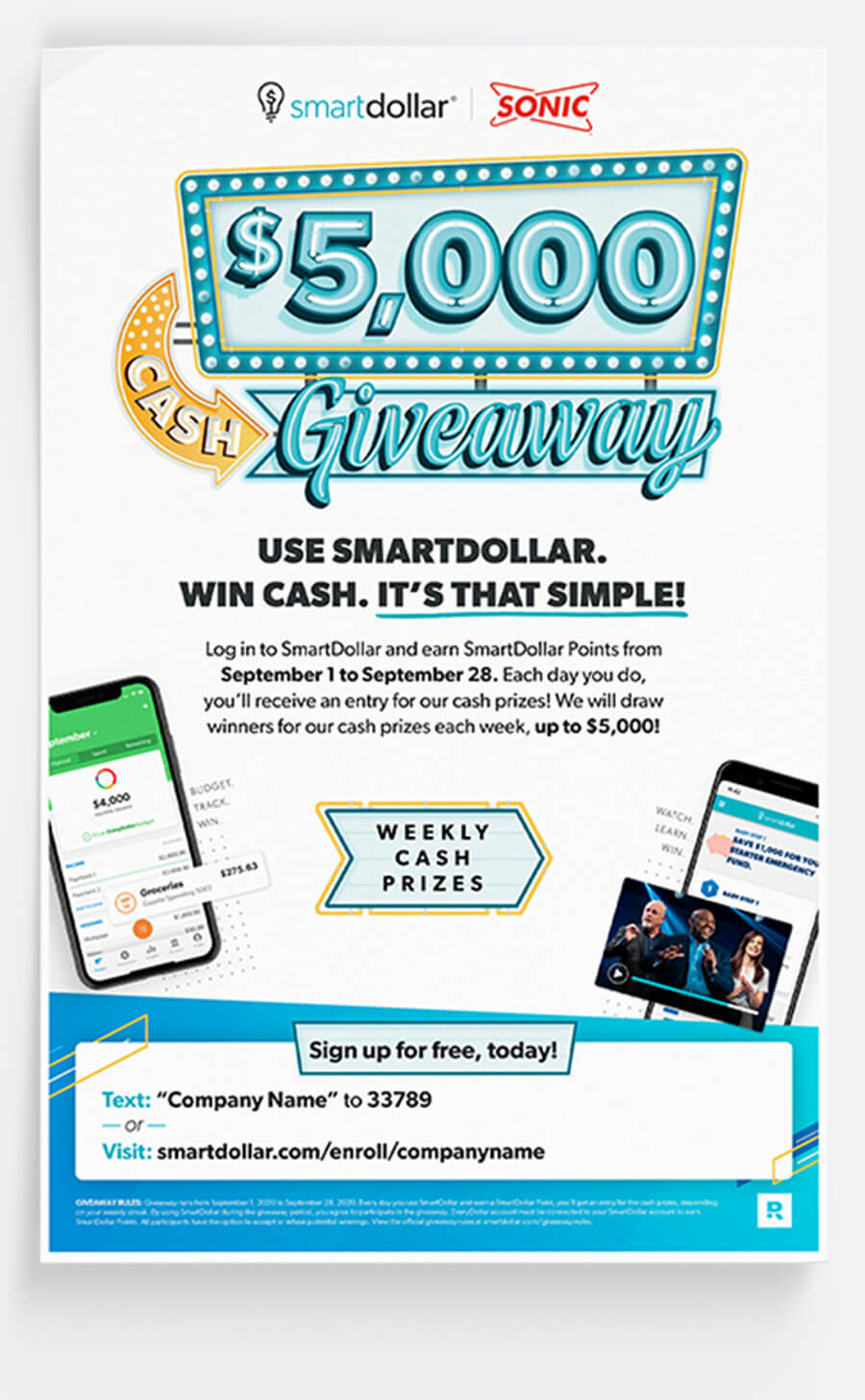
$5,000 Cash Streak:
For our Fall 2020 contest, we explored the idea of expanding from a randomized giveaway to a streak contest. The purpose of the SmartDollar app is to build healthy money habits and what better way to encourage that, than by incentivizing product use with streaks? Essentially, the more users engaged with the app, the higher their chances were of winning more money. Over the month of September, we gave away a $10,000 prize split over four tiers.
I wanted to anchor the poster design around a central, flashy typographic treatment that would grab users’ attention. I liked the idea of incorporating a set of light bulbs with a thunderbolt mark that lit up consecutively as a nod to their weekly streak.

Initial Sketches and Conceptualization


Final Cash Streak Sketch
Alternate Giveaway SketchStreak vs Giveaway:
After some internal feedback, we got some pushback on the streak idea. Considering this was driving new sign-ups and potential users may not have been familiar with us, we were wary about overcomplicating the contest. As a team, we decided to default back to calling it a giveaway in order to make everything seem simple and straightforward. This required slightly retooling the sketches I had made but, ultimately, this was the right call for the sake of clarity.

Prize Tier Sketches and Additional Assets
User Tests:
Before making the final call whether or not the streaks were too complex an idea, I ended up designing two variations of the poster. One featured the tiered, cash prize system while the other simply highlighted weekly cash prizes like our other randomized contests. We then printed out both and presented them to lobby visitors to see which idea resonated best. It was a very close vote but, ultimately, people preferred the simplicity of a giveaway without needing to get overly bogged down by the details of what qualified as a streak.


Simplified Giveaway Graphic
Digitized Prize Tiers
Layered Typographic ProcessFinal:
With this user feedback, I worked with our marketing team to finalize the rest of the poster. We collaborated to simplify the messaging and add clarity for the parameters of the contest as concisely as possible. I added a couple of devices with callouts of tracking a budget or watching a video as examples of ways to win cash easily. Each poster featured a customized section where clients could add in their unique links for signing up for SmartDollar.
Final Poster Design$5,000 Spring Giveaway:
For our spring 2020 contest, we wanted to focus on a large cash prize. At the time, it was the most money we had given away in a single contest period. Our goal was to inspire people to engage with the product, set money goals, and use potential winnings to speed up their financial progress.

Concept Exploration and Connecting User Stories
Rough Sketch of Initial Poster LayoutChallenge:
As a company, Ramsey Solutions drew a line in the sand to no longer use stock photography. I collaborated with a co-worker to shoot our own imagery so we could feature everyday items as elements to use within the contest.
Ideally, we wanted winners to use the prize money towards their money goals, but as it was a free cash prize, we couldn’t tell them what to do with their winnings. I worked with our team to harness the stories and accomplishments of other feature SmartDollar users as aspirational identities for what could be accomplished with the extra cash.

Final Images from Photo Shoot
Creating Props for Our Photo Shoot
Sketching:
In order to elevate our photos so they didn’t look generic, I sketched out a series of quirky accent pieces to be paired with them. Combined with the aspiration vignettes, it helped users connect to fun, motivational goals they could realistically achieve with the $5,000.
In order to keep the hand-drawn feel, I sketched everything out on paper and scanned them into vector art using the Adobe Shapes app. This allowed me to scale the images easily while keeping the rough edges and imperfections for added character.

Accent Sketches and Exploration


Final Poster Design
Layered Typographic ProcessSimplifying the Concept:
With these elements added, I cycled the posters around for feedback. Our team was divided. We loved the playful aspect of the compiled design, but ultimately it felt too busy and cluttered. Eventually, we opted to strip the illustrations and photos back, focusing on the users over the everyday items. We also simplified the messaging, removing steps 1, 2, and 3 and combining them into a single entry step.

Final Campaign AssetsFinal Assets:
With everyone on board, I completed a poster, flyer variant, and media slides that clients could to promote the contest internally and boost enrollment and engagement. Each asset contained space for clients to customize their links and details. We also created an email journey to walk users through the finer details of the contest, with user success stories to keep them motivated to stick with their goals.