

SMARTDOLLAR WEB DESIGN


SmartDollar: Franklin, TN
SmartDollar Homepage
SmartDollar is the leading financial wellness program that meets employees where they are and teaches them how to budget, save for emergencies, and retire with confidence. We needed to update our homepage to better reflect the quality of our product and brand and to be cohesive with our new tone and feel.
Services Provided:
Visual Identity and Discovery
Iconography and Graphics
Web Design

Old Homepage:
Our old home page worked well but didn’t match our updated brand because it featured a lot of illustrations and stock photos that needed to be updated. We wanted to keep some of the core messaging while matching our new voice.

Content Strategy/Key Sections for New HomepageStory Arc:
Before jumping into the weeds, our team sat down and dissected our old home page. While it explained the need for financial wellness, it focused too much on stats and product features. We wanted to revamp the page to highlight program benefits and share real stories from our users and clients about their experiences. We also wanted to highlight our connection to Ramsey Solutions and Dave Ramsey’s plan that has helped millions of Americans get out of debt. His kind of long-term success is unheard of in the financial wellness space and serves as a distinguishing factor of the program’s value.


Updated Homepage SketchesProcess:
After working through the content and messaging with our marketing team, we got down to re-designing the page. My team and I worked together through Abstract to quickly hand off Sketch files and iterations as we tried different ideas. Once the core elements were designed and scoped, I got the page built in our new content management system, Magnolia.
Visually, it was important to highlight the brand’s humanity. We included brush fonts and marker treatments to add a more organic feel to our content and give it that human touch. We added different layers and depth to our imagery to keep it dynamic and included angled shapes with slanted lines to denote speed, action, and the forward movement that employees will experience through our program. We also incorporated a collage of SmartDollar users as background elements to nod to the wide range of clients and employees we work with. No matter the workforce, we wanted employers to be able to visualize their own employees being helped.
As a digital product, it was important to mix in a number of digital devices to showcase the many ways employees can access our programs. With a mixed user base across different operating systems and mobile devices, I was intentional about sourcing as many different brands for our mockups as possible so clients could easily visualize it working for their employees.


Final Page:
Through sharing updates and results, we made a more compelling case for why SmartDollar remains the best financial wellness program out there, rendering our homepage more effective and helping us convert leads faster.
SmartDollar: Franklin, TN
Financial Wellness Definitions Page
As the financial wellness industry has developed over time and more competitors have entered the marketplace, we realized it was important to establish the true definition of financial wellness. Since we removed many stats from our homepage, this was a good opportunity to advocate for why companies really need a financial wellness program. We wanted this new page to be content-heavy to improve our SEO rankings and help us deliver valuable information to even more people.
Services Provided:
Visual Identity and Discovery
Iconography and Graphics
Web Design


Financial Wellness Definitions Page Feature Section SketchesMessaging:
We wanted the tone of our content to be conversational and human, injecting hope into the difficult topic of finances. In order to complement those messages, we visually broke the content up to highlight short, motivational statements on bold, attention-grabbing gradients. We also accented many of our key statements with a brush script and added some playful, scratched-out elements to headlines to illustrate embracing mistakes and learning from the messy elements of life.


Examples of Messaging StylingIconography:
One of the key pieces I worked on was the iconography that would serve as an extension of our brand. The challenge was to distill many different icon styles we’d used over the years into a single, cohesive set. I started by compiling our most frequently used icons and sketching key imagery for our most popular topics.
Old Icon Styles
Sketches of Key Iconographic ImageryProcess:
Once I had the core imagery worked out, I moved on to exploring different icon styles within a limited color palette that could be easily adjusted for readability. I also wanted to play with different lines and shapes to add motion, depth, and energy. Once I narrowed it down to a few directions, I applied the styles to four common icons we used and presented them to my team.
Icon Style Exploration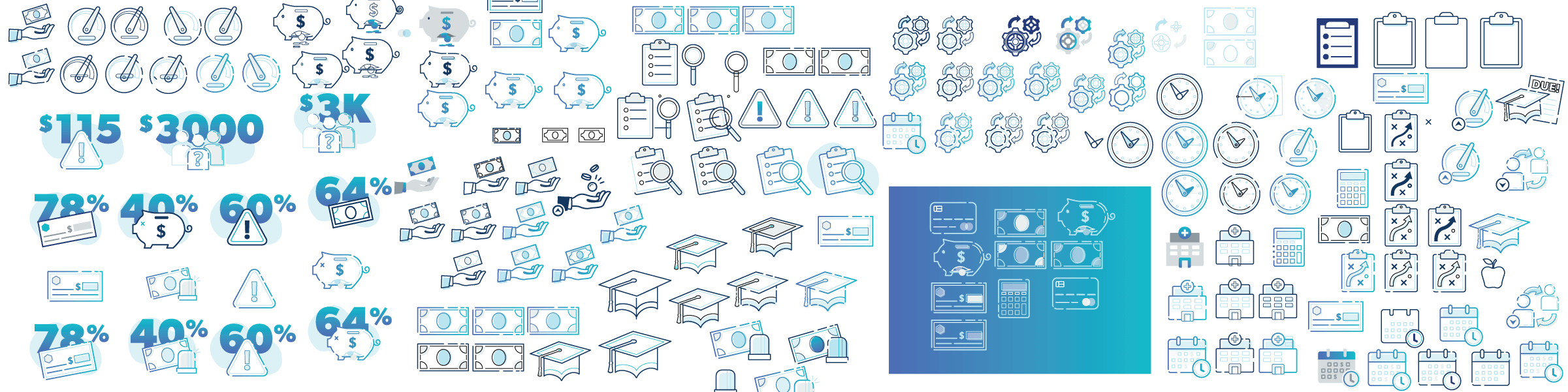
Final Icons:
After talking it through, we were able to get a consensus on combining a couple of ideas for our final direction, which incorporated playful cut lines and energetic accents. We opted for a linecon style so that the icons wouldn’t be too visually heavy when combined with text, and picked a simple, three-color system that could easily be adjusted for both light and dark backgrounds. The final icons served to better connect with our branding while remaining unique and bold in the general marketplace.
Photos:
I also worked on exploring new ideas for how we displayed photos. Up to this point we often contained them in geometric shapes, but I loved the idea of incorporating spheres to stand out from the many angled lines and soften up the design. I wanted our photos to break the frame and add additional layers of depth while including fun brush strokes for a splash of color to feature a photo grid of SmartDollar users.

Sketches of Photo Styles

Final Page:
All the elements came together to make a cohesive case for financial wellness, connecting the tone and spirit of the content to interesting visuals and delivering a true definition of financial wellness to companies to help them understand what they truly need to help their teams thrive.