Costco: Issaquah, WA
Promo Campaign:
As a SmartDollar client, Costco asked our team to design custom print assets they could distribute to their staff highlighting SmartDollar as their financial wellness benefit. They wanted a series of pieces including a 10 ft. floor vinyl, locker magnets, button pins, flyers, and posters. They wanted a number of options that Costco team members could use to decorate their break rooms in an effort to make a large, company-wide push to improve financial habits.
Services Provided:
Visual Identity and Discovery
Campaign Design
Digital Illustration
Email
Approach:
As a team, we brainstormed a number of different slogans to anchor the campaign around. Initially, Costco liked the idea of a spring savings challenge to promote building a healthy emergency fund. After talking it through, they decided they wanted something that was more long-lasting, so we focused on the idea of behavioral changes surrounding money.
I took those initial topics and concepts and distilled them down through sketches and digital proofs to two final directions for consideration.
Campaign Slogan Sketches and Exploration
Final Two Campaign Slogan DesignsFloor Banner:
After choosing “change the way you think about your money” as the final direction, we started creating assets. I was tasked with tackling a 10 ft.-long vinyl floor banner for employee break rooms.
I was drawn to the idea of illustrating a journey and reaching your goals, so I connected the idea of hiking up a mountain and reaching its peak, asking employees to take the first step towards a new financial future.
Email Header and Hero Imagery For Corresponding AssetsProcess:
With the core concept in mind, I sketched initial ideas, utilizing the length of the banner to our advantage. While starting your financial journey can feel as daunting as climbing a mountain, I didn’t want it to feel overwhelming. I focused on an illustrative approach that featured bright, hopeful colors.
Using Illustrator, I sectioned it off into varying hills and ranges to really give the banner a sense of depth. I worked in a winding path to guide people’s eyes through the design and connect the message from the bottom of the piece to the top.
Layered Banner Design ProcessBaby Steps Pin:
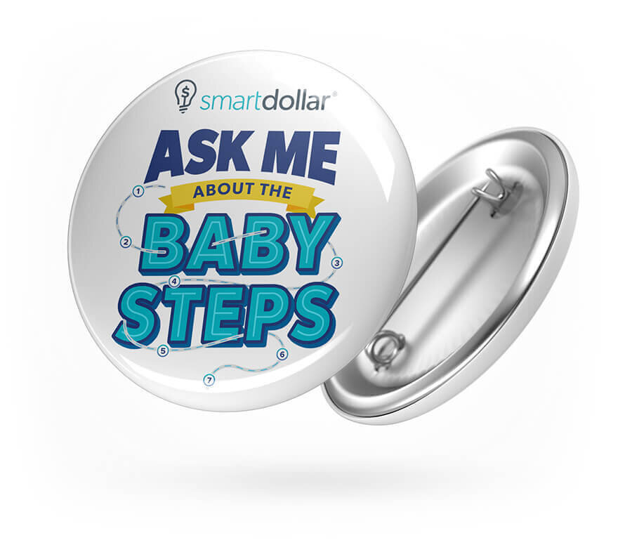
I also designed pins for veteran Costco employees who had already been using SmartDollar. These were conversation starters, helping them invite other employees to the program and to learn about how it had changed their lives.
The Baby Steps are the seven core steps that everyone walks through in our product to reach their ultimate financial goals. I wanted to carry the theme of a connected path that people could follow in all of the campaign’s pieces.

Process:
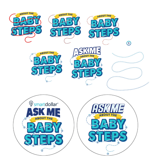
I worked up a number of different initial directions in Illustrator for the seven Baby Steps to connect the idea of step-by-step instructions that are easy to follow to get where you want to go. While I loved some of the initial blueprints and technical typography, I wanted everything to feel simple and achievable, so I returned to the idea of a path with a seamless pattern of icons representing each of the baby steps.
Final Button Pin Design WorkBabySteps Seamless Pattern Exploration


