
World Help Web Design


World Help: Forest, VA
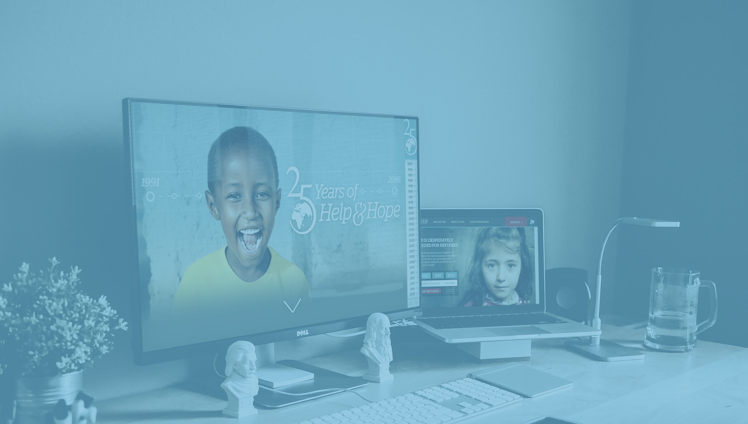
25th Anniversary Timeline Site
In 2016, World Help celebrated its 25th anniversary. To kick off the year of celebration, we launched a timeline site to look back on the highlights that brought us to where we are today.
Services Provided:
Visual Identity and Discovery
Experience Strategy
Iconography
Social Media and Email Campaign
Web Design
Photo Editing
Approach:
I worked with our developer on designing a custom microsite to celebrate the occasion and capture the defining moments for our organization over the past 25 years. We wanted something interactive with dynamic content and engaging videos that could link out and give donors a chance to continue supporting many of our long-term projects.
Navigation:
We knew we had to find a creative solution in order to adequately cover 25 year’s worth of content highlighting annual events without having too long of a page to scroll through. I worked with my developer on a multi-directional approach in which users scrolled up and down between the years and left and right through the events within each year, allowing users to still get all of the information through a condensed process.

Landing Page Structure
Navigation Exploration Sketches
Side Navigation ExplorationPhotography:
Looking back, we knew photos were going to be difficult to work with. Most of our photos taken before 2005 were scans of old prints and, as a result, many of the pictures were too low quality to highlight. However, a picture is worth a thousand words, and we still wanted to find a way to feature our old photos in conjunction with past stories.
I settled on using the photos as backgrounds with darkened fades, allowing us to use the images prominently while hiding the pixelation and focusing on the content for each year. If visitors wanted to view the picture, they could hide the overlay but, for the most part, the pictures remained somewhat hidden behind the transparent fade.


Old Photo Samples

Photo Overlay DesignWorld Help: Forest, VA
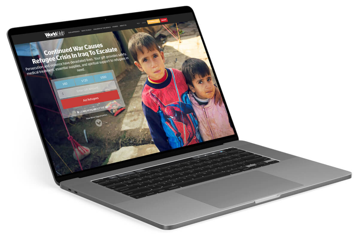
World Help Homepage
In 2016, we also decided to update our website, as the old one was inconsistent and lacked a number of features that we wanted to utilize going forward. Our developers worked hard to build the infrastructure, and I was brought on to advise on the visual direction and overall user experience within our new site.
Services Provided:
Visual Identity and Discovery
Updated Brand Guidelines
Experience Strategy
Photo Editing
Old Site:
We knew there was a lot we wanted to change about our old site, particularly in the hero section. It was difficult to change the CTA’s on our featured hero section, which often required us to double stack images if we needed to respond to a crisis. This refresh gave us an opportunity to fix a lot of the usability issues we came up against every day.
Approach:
Before jumping into any designs, I met with our developers to map out some basic rhythms and structures as we started the wireframe process. We talked through some of the most common components we wanted to build out and started assembling a library of UI elements. I was also able to update our color scheme, stripping back eight rarely used secondary colors down to six colors. I was also able to boost the vibrancy and inject more hopeful color tones into our brand.

Hompage Ideas and Sketches
UI Elements and ExplorationNavigation:
One of the biggest problems to tackle was navigation. With our old site, we still had the three main options of “What We Do”, “Ways to Give”, and “Child Sponsorship,” but these options lead to index pages that didn’t take users very far. After running a usability study, we found that most visitors were simply jumping to the footer or running a search to find the pages they were looking for. Either way, we knew our content was too buried and too difficult to access.
The first solution came in implementing the mega menu which provided a drop-down that listed the many pages within each section. Not only was it easier to navigate, but it also reduced redundant pages and allowed for a feature space to highlight donors, announce concert dates for our international children’s choir, and include specific asks that corresponded with monthly campaigns.

Mega Menu Mockup with Customizable Feature SectionsCard System:
Throughout the site, we also introduced a new card system that allowed us to easily highlight specific information while improving the site’s consistency. We could use them to feature different projects, donation options that corresponded with our house mailings or even advertise our most recent blogs.

Card Mockup with Expandable Content
Blog Card MockupSponsorship Widget:
Child sponsorship is an important part of World Help’s model and one of the most popular ways that people supported our organization. We wanted to be able to make sponsoring a child as easy as possible, right from our homepage. In the past, we had a simplified widget that connected a donor with a child, but it linked out to a secondary landing page, adding more steps and noise getting between a donor and their ability to sponsor a child.
With that in mind, we re-imagined the sponsorship experience by setting up a tool that allowed users to search for a child by country, gender, and age. From there, it pulled up a series of results that best matched the search criteria, and, in the same window, they could read the child’s bio to learn more or click the “sponsor me” button to streamline the process.
Additional Features:
With the updates, our team was able to build out some additional features, including an interactive impact map allowing users to click through the countries we work in and get an overview of various projects. We also re-worked the footer to capture many of our most important pages while featuring our financial commitments and donation pie charts. As a non-profit organization, one of the most frequently asked questions was how we distributed funds, and this redesigned space provided clarity around that while highlighting trusted third-party organizations.

Dark Final Footer
Updated Sub Pages With New Colors and Design System
Alternate Light Footer

Updated Sub Pages With New Colors and Design System